
Have you seen our new Analytics Dashboards in VQ Conference Manager yet?
If not, read on…
Log into VQ Conference Manager. Click on Kibana, and you’ll see the new Analytics Dashboards.
Starting with the Welcome Dashboard.
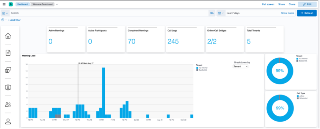
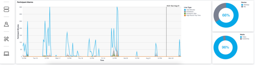
Here you can see an overview of the activity on your system. In the above screenshot, we’re looking at activity over the past seven days. There are top-level metrics across the top of the page, pie charts to the right and two graphs for meeting load and participant alarms.
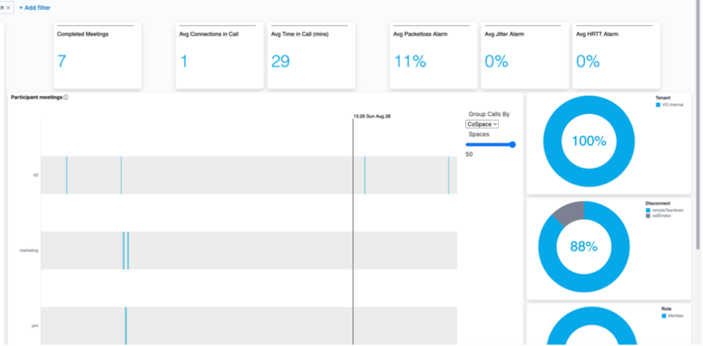
Using the navigation bar, you’ll have access to additional dashboards, including call, participant, call bridge and tenant timelines.
So, let’s look at a few examples:
Completed Meetings
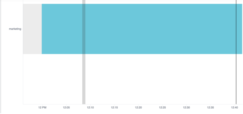
Click on Completed Meetings > View Meetings and you get taken to the Call Timeline:
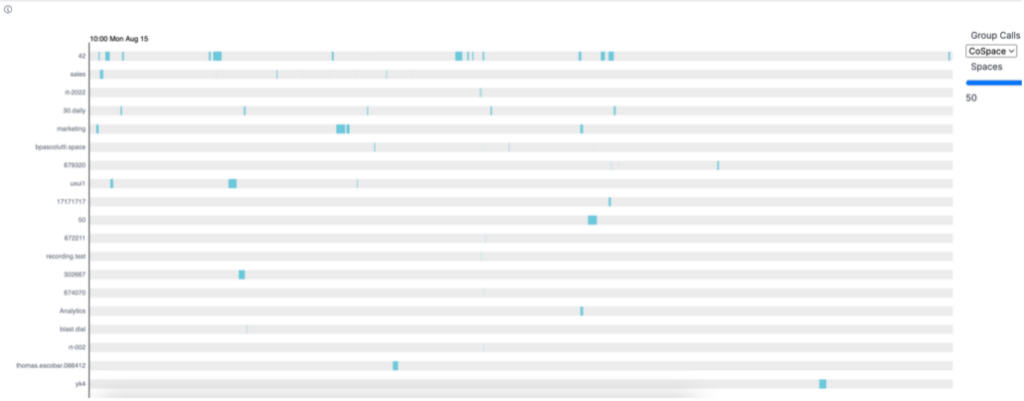
Under the ‘Call Timeline’ report, you’ll see all calls, represented by blue rectangles. The start of a rectangle indicates start of the call, and the end of a rectangle indicates end of the call. In this example, we’ll select just one call – Marketing.
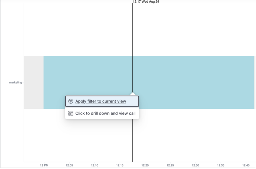
To find the call you’re looking for, you’ll need to narrow the results. This is done by adding a filter cospaceUri.keyword;marketing, in the Kibana Query Language (KQL) bar at the top of the Dashboard. Select a time range and click ‘Apply the filter to current view’ to update the results.
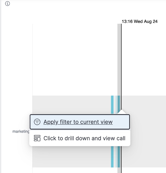
Click on the call and select Click to drill down and view call
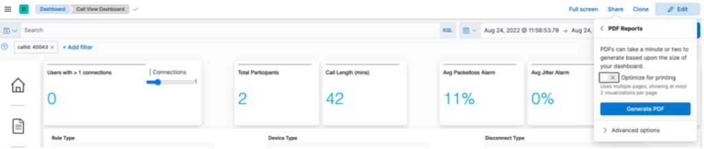
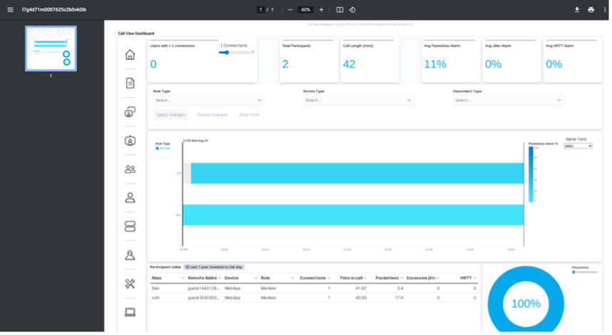
Clicking this allows you to view a range of metrics for this call in the Call View Dashboard:
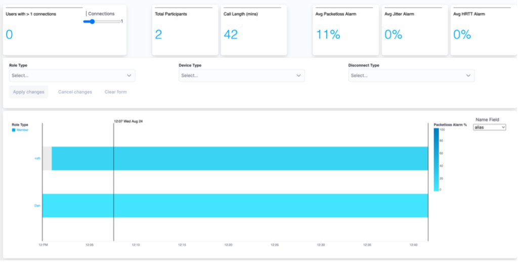
These metrics include top-level metrics, for example, the number of participants, the average alarms and the call graph. The call graph displays the start and end of each of the Participants (Call Legs).
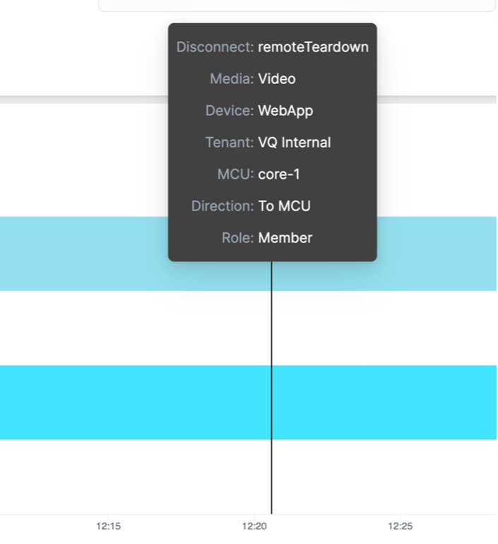
If you hover over the Call Leg, more information is displayed, such as media type, the reason for leaving the call, etc:
Further down the Dashboard, the pie charts show the Disconnect Reasons and Device Types in the call:
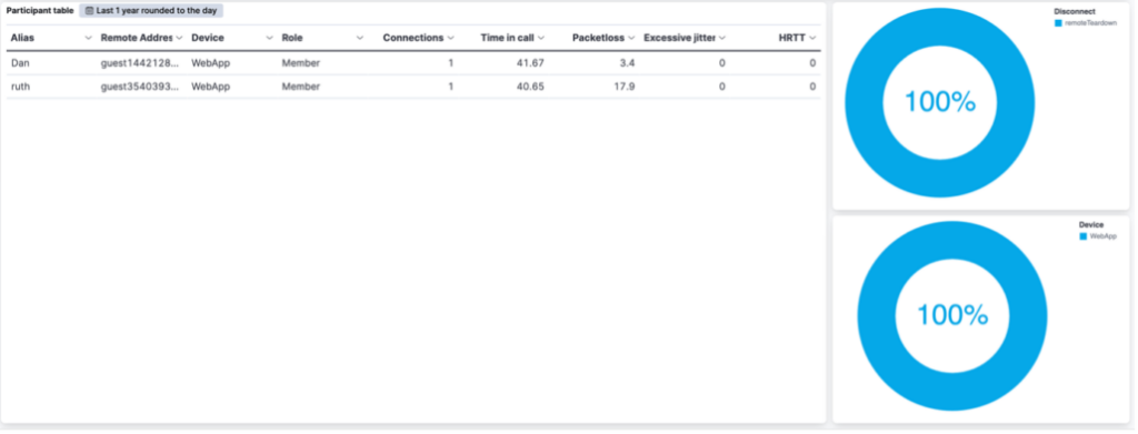
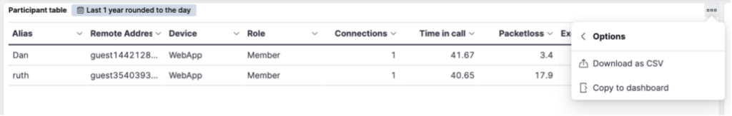
For those of you familiar with Lens, this table is editable. Additionally, it can be downloaded as a CSV file for sharing with colleagues.
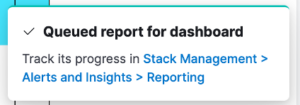
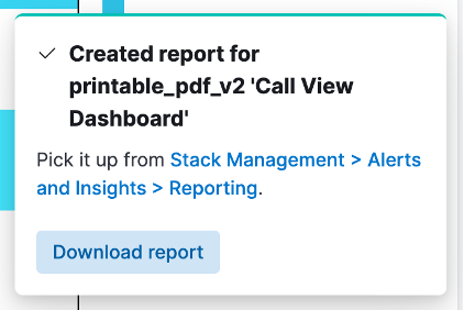
There is also the ability to share the entire Dashboard. In this example, we’ll export it and share as a PDF:
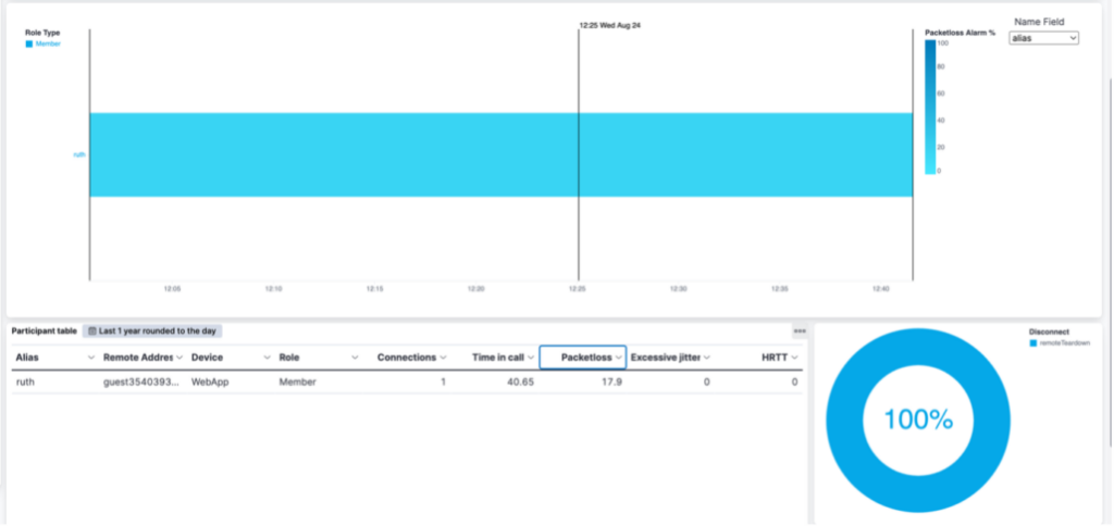
Doing this takes you to the Participant View Dashboard. In this example, we are looking at Ruth’s call activities over the past seven days:
This blog is just a very brief introduction to a few of the VQ Conference Manager Dashboards and how to navigate around them. For more detailed information, view our Analytics video or join our Webex Space if you have any questions.
Finally, for those looking for a more detailed understanding of the capabilities of VQ Conference Manager Analytics, we offer a three-day course delivered by our training partner, Scott Waschler, from TeKnowLogical Solutions.